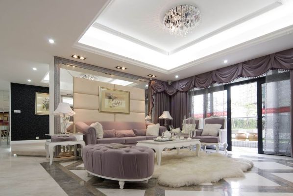
This year is about to leave us and we are going to welcome a new year soon which means that we have to renew our life to suit the new year. Our homes also need to be modernized since we spend a long time in them and they are the only place in which we can find comfort and host our guests. Modernizing our homes can be achieved through interior design software or purchasing new furniture and accessories but this may be costly for most of us and this is why we have to look for another way for refreshing the look of our homes.
You can easily renew your home through changing the colors that you already have in your home and using new colors that cope with the latest changes and color trends that are presented every year by designers for interior designs. There are new colors that are going to be used for the new year in our homes and some of these colors are presented in new shades while the others are inspired by the retro colors that were used before whether it is in the last year or during the 70s, 80s and 90s. Here is a quick glance at the top 10 hottest and newest color trends for interior design to decide the best colors that you are going to use inside your home.
How Interior Design Color Trends Are Changing in 2026
As we navigate through modern interior design, exciting new color trends emerge to redefine our living spaces. Every thoughtful palette and carefully selected hue shapes a contemporary home, blending timeless elegance with fresh creativity for 2026.
1. Chocolate Brown – The New Symbol of Warmth and Luxury
Rich chocolate brown brings incredible depth and sophisticated warmth to any modern interior scheme. This luxurious earthy tone acts as a phenomenal neutral base, replacing cooler grays with comforting vibes that elevate your overall decor effortlessly.
How to Use Chocolate Brown in Modern Living Rooms and Bedrooms
You can easily incorporate this decadent brown hue into your living rooms and bedrooms through upholstered furniture, plush textiles, or a striking accent wall to create a cozy, inviting atmosphere for relaxation.
Best Color Combinations for Chocolate Brown Interiors
Pairing deep chocolate brown with soft beige, creamy ivory, and subtle green accents creates balanced color schemes that enhance visual interest while maintaining a serene and harmonious environment throughout your entire home.
2. Restorative Green – Bringing Nature and Calm into Your Home
Embracing restorative green shades allows you to invite the outside world directly into your residential spaces. These nature-inspired colors foster a profound sense of calm, making them exceptionally popular among top interior designers today.
Popular Shades of Green: Sage, Olive, Eucalyptus, and Moss
Explore gorgeous variations that offer unique versatility, helping homeowners craft tranquil environments tailored to their personal lifestyle and aesthetic preferences, such as:
- Soothing sage
- Earthy olive
- Refreshing eucalyptus
- Moody moss
How to Incorporate Green into Different Interior Spaces
Apply these versatile green hues to kitchen cabinetry, bathroom tiles, or bedroom accent walls. Integrating organic tones transforms ordinary rooms into revitalizing sanctuaries that celebrate natural beauty and promote daily relaxation.
3. Warm Khaki and Earthy Neutrals – A Sophisticated Alternative to Gray
Moving away from stark minimalism, warmer neutrals like warm khaki provide a sophisticated alternative to traditional gray. These versatile earthy tones deliver exceptional comfort and understated elegance to modern residential interior spaces everywhere.
Why Warm Neutrals Are Becoming Popular in Modern Homes
Homeowners increasingly desire cozy environments that feel grounded and welcoming. Warm neutral color palettes successfully achieve this balance by offering a timeless backdrop that complements diverse furniture styles and decorative accessories seamlessly.
Beautiful Color Combinations with Khaki, Beige, and Sand
Combine sophisticated khaki with classic beige and sandy hues to build layered, cohesive interiors. These harmonious color schemes maximize light reflection while ensuring your rooms remain wonderfully cozy, stylish, and visually engaging.
4. Burgundy and Wine Red – Bold Colors for Elegant Interiors
Introduce dramatic flair into your living spaces with captivating burgundy and rich wine red. These bold colors infuse spaces with undeniable sophistication, making them ideal choices for creating striking focal points in stylish homes.
How to Add Burgundy Through Walls, Furniture, and Accessories
Experiment with saturated burgundy paint colors on dining room walls, velvet statement armchairs, or decorative throw pillows to inject luxurious warmth and personality into your thoughtfully curated interior design project.
Best Colors to Pair with Deep Red and Burgundy
Balance the intensity of deep red and burgundy by pairing them with soft cream, muted taupe, or subtle green tones to achieve a refined, well-proportioned aesthetic that feels both dramatic and welcoming.
5. Smoky Jade and Deep Teal – Fresh Colors with a Luxurious Feel
Smoky jade and deep teal represent exciting color trends for interior design that introduce fresh, nature-inspired blue-green hues into modern homes, creating a luxurious and serene atmosphere for everyday living.
The Appeal of Nature-Inspired Blue-Green Shades
These captivating nature-inspired shades provide an incredible sense of calm and visual interest, making them exceptionally popular among interior designers looking to elevate residential spaces with sophisticated and refreshing color palettes.
Creative Ways to Use Jade and Teal in Kitchens and Bathrooms
You can easily incorporate these striking hues into your kitchen cabinetry or bathroom tiles to establish a bold focal point that completely transforms your interior design into a stunning, contemporary sanctuary.
6. Earthy Ochre and Golden Yellow – A Warm and Artistic Touch
Earthy ochre and radiant golden yellow bring a warm and artistic touch to any home interior, infusing living spaces with vibrant energy and timeless elegance that effortlessly brighten up modern architectural designs.
How Ochre Adds Character and Warmth to Interior Spaces
Using rich ochre paint colors helps add depth and warmth to your rooms, creating an inviting environment where earthy tones harmonize beautifully with natural materials and stylish decorative accessories throughout the house.
Decorating with Golden Yellow Without Overwhelming a Room
Apply golden yellow as a carefully balanced accent color or on a striking accent wall to inject personality and cheerfulness into your home without overpowering the serene and cohesive overall neutral palette.
7. Desaturated Sky Blue – Creating Peaceful and Airy Interiors
Desaturated sky blue offers a wonderful opportunity to design peaceful and airy interiors, utilizing muted tones to establish relaxing environments that promote tranquility and effortless style across your entire residential property.
Why Muted Blue Works Beautifully with Natural Materials
This soft blue hue pairs exceptionally well with natural stone, warm wood furniture, and organic textiles, enhancing the overall interior design by combining soothing color schemes with tactile, authentic elements.
Best Rooms and Color Palettes for Soft Blue
Introduce this versatile paint color into bedrooms, living rooms, or home offices to cultivate a remarkable sense of calm, perfectly complementing lighter neutral color palettes for a truly harmonious home decor.
8. Butter Yellow and Lemon Vanilla – Soft Colors That Brighten Modern Homes
Butter yellow and lemon vanilla are delightful soft colors that instantly brighten modern homes, offering a refreshing departure from stark white while maintaining an airy and welcoming ambiance in every room.
How to Use Pale Yellow for a Cheerful and Welcoming Atmosphere
Incorporating pale yellow hues through walls or decorative accessories creates a cheerful atmosphere, allowing homeowners to embrace uplifting color trends that celebrate positivity and joyful living spaces all year round.
Beautiful Combinations with Cream, White, and Pastel Shades
Combine these buttery tones with soft cream, crisp white, and gentle pastel shades to build sophisticated color schemes that maximize natural light and enhance the overall elegance of your interior design.
9. Terracotta and Warm Mahogany – Earthy Colors with Timeless Character
Terracotta and warm mahogany define the latest 2026 interior design color trends by introducing rich earthy tones and timeless character that instantly ground any room in natural beauty and sophistication.
Using Clay, Rust, and Reddish-Brown Shades in Interior Design
Incorporate clay, rust, and reddish-brown paint colors into your interior design to create a deeply grounding ambiance, utilizing these versatile earthy tones to enhance visual interest and warmth across your home.
How to Combine Terracotta with Wood, Cream, and Green
Pairing terracotta with natural wood furniture, soft cream textiles, and muted green accents results in a harmonious palette, ensuring your interior design feels completely balanced, organic, and effortlessly stylish.
10. Warm Ivory and Soft Cream – The New Direction of Minimalist Interiors
Warm ivory and soft cream represent a major shift in interior design trends away from stark minimalism, offering cozy, inviting color palettes that elevate modern residential spaces with understated elegance.
Why Designers Are Moving Beyond Stark White
Top interior designers are embracing warmer neutrals instead of sterile white paint colors, choosing creamy hues to foster a welcoming sense of calm and sophistication in contemporary home decor.
How to Create Elegant Interiors with Creamy Neutral Shades
Layering various creamy neutral paint colors allows you to build a sophisticated interior design scheme, adding depth and cozy warmth that transforms everyday living areas into serene and stylish retreats.
How to Choose the Right Interior Color Palette for Your Home
Selecting the ideal interior design color palette requires careful consideration of various elements, helping homeowners establish cohesive and visually stunning color schemes that reflect their personal aesthetic preferences.
Consider Room Size, Natural Light, and Existing Furniture
Before choosing paint colors, ensure your chosen palette enhances the space and creates a harmonious atmosphere throughout the house by evaluating the following:
- Your room dimensions
- Incoming natural light
- Current furniture
Understand Warm and Cool Undertones Before Choosing Paint
Analyzing warm and cool paint undertones prevents clashing color schemes, allowing you to curate a seamless interior design where every hue complements your chosen furniture and decorative accessories perfectly.
Follow the 60-30-10 Rule for a Balanced Color Scheme
Applying the 60-30-10 rule ensures your interior design remains balanced by breaking down your color palette into the following proportions:
- A dominant neutral for sixty percent of the room
- A secondary tone for thirty percent
- A bold accent color for ten percent
How to Incorporate 2026 Color Trends into Every Room
Integrating the newest 2026 interior design trends into your living spaces allows you to refresh your home decor, utilizing trendy paint colors and thoughtful palettes to elevate every single room.
Trending Colors for Living Rooms, Bedrooms, and Kitchens
Apply popular paint trends to your living rooms, bedrooms, and kitchen cabinetry, using sophisticated earthy tones and cozy hues to transform these essential spaces into stylish and welcoming sanctuaries.
Modern Color Ideas for Bathrooms, Dining Rooms, and Home Offices
Revamp your bathrooms, dining rooms, and home offices with modern color palettes, incorporating elegant accent walls and nature-inspired shades to boost productivity and relaxation in your daily environment.
Conclusion: Give Your Home a Fresh Look with the Newest Interior Color Trends
Updating your living spaces with the latest 2026 interior design color trends guarantees a stunning transformation, allowing you to enjoy a timeless, beautiful, and deeply comforting home environment all year round.